Skol
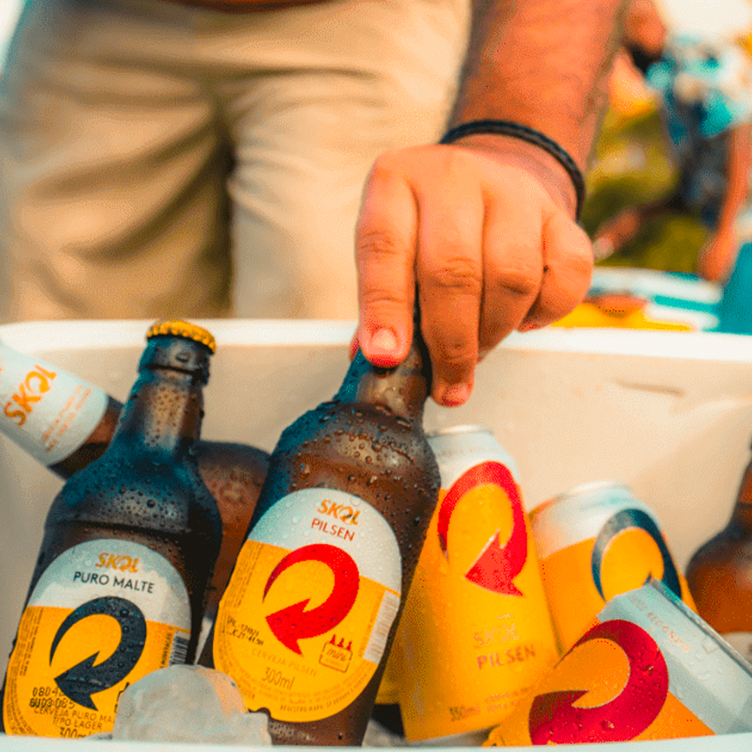
Challenge Align Skol's body and soul. In order to reflect your young, dynamic and disruptive soul. Build a graphic system for the brand as a whole, aiming to have a visual structure that will derive for all lines of its products. Pilsen, Hops, Pure Malt and derivatives. This was Tátil's challenge to redesign the most appreciated beer packaging in the country. They should be key moments in communicating the universe of values and sensations that the brand represents. SolutionIt was a work of pure immersion in the main moments of connection of Skol with its public, understanding what was the representativeness of the brand and what type of emotion it should create.
The new packaging valued the main visual assets of the brand: yellow and arrow, and the aesthetics of glass of beer. In addition, we retrieve the "round drop" because it is a strong concept and able to express the functional and emotional attributes of the product.results. Our choices have ensured a more current look for the brand, suitable for your audience and with a huge strength in the POS.
We managed to reflect the Skol attitude also on the packaging. And all this without giving up the brand recognition, which according to surveys, was even more immediate than the
previous packaging.
WORK DONE WITH:
TÁTIL DESIGN
TÁTIL DESIGN
ROLE: GRAPHIC DESIGNER