Padre Bruno
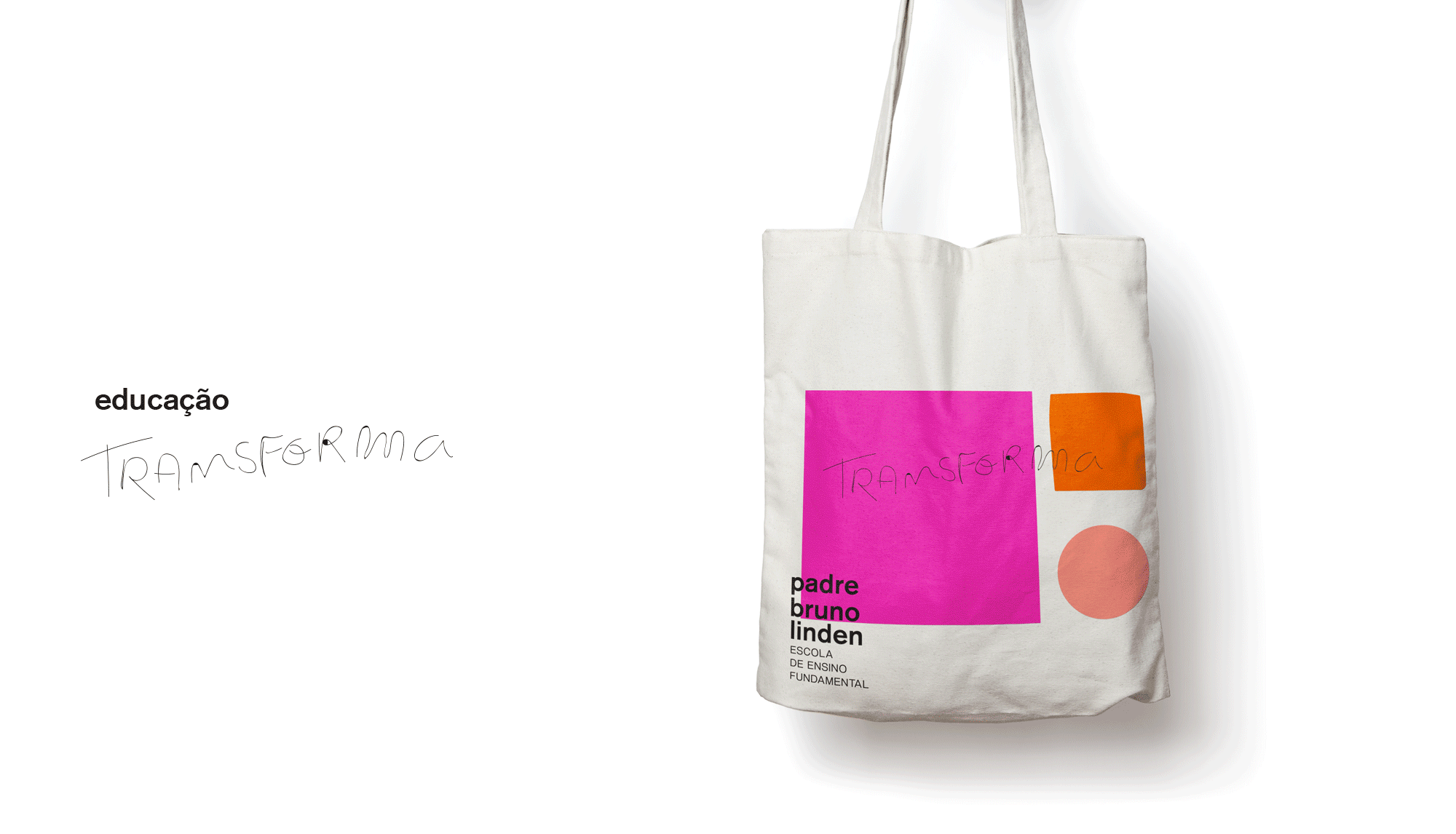
Padre bruno The logo was developed based on the basic shapes of geometry. Using thought in a human way for education, the main way to train women and the career of each child. Symbolizing the beginning of the academic formatio of each child and its evolution. The visual to mark, all visual identity and branding use the concept of the shape of geometry, design all the vis from school of the middle of education. The basic and main form of the brand is to evolve and transform into others, being the principle of school, the transformation of the child through education. The education still transform.
The education still transform.
WORK DONE WITH:
Freelancer
Freelancer
ROLE: ART DIRECTOR
GRAPHIC DESIGNER
GRAPHIC DESIGNER